What’s the thing?
Absolutely sure you are familiar with this: You want to present a first concept of a digital solution. In order to give a clear and realistic idea, you use high fidelity designs to illustrate the existing visual conditions and opportunities. What we need from the stakeholders in this project phase is detailed feedback on user requirements, business cases and technical feasibility. But what we often get is a discussion leading into smaller and smaller details like “What icon should we use here?” or “Which color should this button have?”
To reduce distraction, to save time, to enhance the iteration process and to focus on the user experience we decided to take a step back from high fidelity perspective and return to the basis with Wireframes. Because: sometimes less is more!
What are Wireframes?
Wireframes can be considered as the skeleton of a digital interface. The reduced appearance allows to focus on the content structure and user interactions. It helps to find out the most user friendly and logical arrangement of the several components. Working step-by-step on the UX before applying UI, is not merely intuitive, it is also faster and goes in a well structured project flow. The accelerated prototyping allows to simply apply feedback before designers and developers are starting their work. Hence we obtain more efficiency by avoiding redundant work.
Allianz Wireframe Pool
Our ambition is to make UX designers life easier by providing them a toolbox, which offers a modular approach that matches the requirements of our stakeholders and ensures re-usability and brand consistency across the group.
Currently there are a variety of projects at Allianz that are already at an advanced stage of development. As primary basis we took the already existing high-fidelity UI designs and successively simplified their appearance.
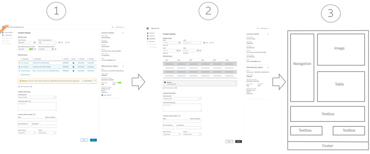
1. First, we grayscaled the existing design and translated all corresponding element states.
2. Further we replaced specific content by generic placeholders. Unnecessary functions were removed.
The result is a scribble-like template that shows the clean structure of standard Allianz interfaces. And as we love at GDF to simplify workflows, we created a Wireframe standardized library, which provides several templates, modules and elements that can be used by every Allianz UX Designer worldwide.

Lets take a look on an example:
Our UX expert Alina is working on an application that allows Allianz customers to raise a claim. Her top priority is to get an understanding about the business requirements and the technical restrictions, so she can propose a user-friendly and intuitive solution.
Until now Alina used the high-resolution design library to discuss her UX concepts with project stakeholders and had to answer many questions about visual details such as “Why is the table grey and not blue?" or "This and that picture would fit well here, right?". - At least that's how it was so far.
Using the new Wireframe library allows Alina to sharpen the focus of the discussion. The elements within the library can be easily combined to a standard Allianz interface. The lack of visual noise reduces the associated discussions and gives more room for understanding user requirements and business context. Since Wireframes are generally more adaptable than UI designs, the number of iterations can be increased. This allows to illuminate the customer experience from different perspectives and foster a successful implementation.
Advantages of the Wireframe library at a glance
- The prototyping of a digital solution is much faster, and different layout options can be explored more quickly.
- Feedback and adjustments can be implemented very fast and without significant effort
- Stakeholders are less distracted by irrelevant details and can provide feedback on user needs, business viability and technical feasibility
- Grayscale communicates the Work in Progress status effectively
- More consistency in between the work of different OEs
