Since launch of our internal User Interface (UI) library, which enables an intuitive user experience for transactional web applications, we have always continued to increase usability of our components. In this article we will get into the details of our new concept so called: theming. The GDF developers have worked on implementing theming, which increases usability even more. Until now, the library users were able to consume components in two different styles (B2B and B2C), with theming, there are now endless possibilities.

Theming: The Way to Customize applications
Implementation within our Allianz UI library
The B2C (NDBX) and B2B (Expert) styles already known and used by those who consume the Angular NDBX library are already sufficient for many projects. If you want to further customize the application you are developing, you may be interested in theming.
What is theming?
Theming allows our Allianz employees to use the component layouts provided by the UI library (our Allianz library containing all UX components) and customize various visual features of those components in the UI library, be it the colour, font, line spacing and much more. This allows to adjust components for different branding without using CSS tricks to overwrite the code. This makes the process of customization a lot less time-consuming but also a lot more stable when the library gets updated.
How does it work?
Each component in the UI library, be it a button or a checkbox, provide so called style tokens, which are simply a piece of predefined variables for a specific characteristic of the component. This can be customized to the client’s needs.
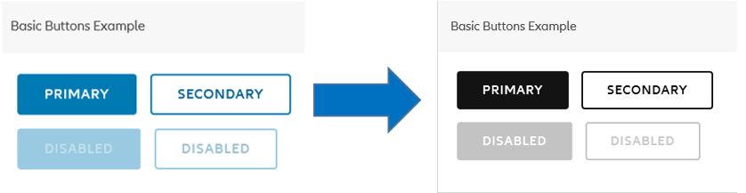
Example to make it more visual accessible:
The most important issue to be considered in theming is accessibility. When choosing colors, you should not overlook the high contrast support of your application.
If a client wants to include a button in the respective branding, he can basically customize it by adjusting the base token responsible for this characteristic, in this case, change the colour to black. If he does customize it, it will show in the design of the button:
This theme can now be imported and used for the developer’s own applications.
Before implementation of the respective branding, everyone should check whether or not the designed theme has the right colour contrast in order to be accessible and effective.
Color selection is not as easy as it seems. It is quite difficult to try to find a reddish(and accessible) error colour in a dark background. When choosing themes for your application, color selection and other possible accessibility issues are under the responsibility of the developers.
Read on: